From Concept to Colour: Inside the Creation of GELCARE’s Nail Polish


It started with a simple question: What if we made nail polish the GELCARE way?
When we first launched GELCARE, our focus was on redefining the at-home gel manicure. Our formulas, packaging, and philosophy set a new standard—clean, minimalist, high-performance. But over time, we felt a pull toward something more familiar. Something classic.
So we began working on a new chapter. One that felt like a return, but not a step back.
A Full-Circle Moment
Stepping into the world of regular nail polish, we felt like reconnecting with the roots of traditional nail care. Gel will always be the future—durable, long-lasting, efficient. But regular polish holds a kind of freedom and artistry that never goes out of style.
This idea had been on our minds for a while. While gel polish has become a cornerstone of our brand, there’s a different kind of beauty in traditional nail polish—one rooted in simplicity, spontaneity, and ease.
This launch is more than just a product expansion. It’s a nod to the history of nail polish—a celebration of timeless rituals reimagined through a modern lens. By offering both, we’re creating a seamless link between past and present.
Something flexible. Something fun. And something that feels entirely GELCARE.
Formula First
Our product development always starts with performance. And this was no exception.
We began with a clear goal: to create a polish that’s clean, pigmented, self-leveling, and effortless to apply. The formula had to feel smooth and glide on without streaking. It needed to dry quickly, deliver even colour in one to two coats, and provide a subtle, natural-looking shine—without requiring heavy layering.
And of course, it had to be 16-free, vegan, and cruelty-free. That meant leaving out ingredients like formaldehyde, toluene, parabens, synthetic fragrance, and other common irritants—without compromising wear or payoff.
We went through multiple rounds of lab testing and formula adjustments to get it just right. Viscosity, opacity, brush feel—we fine-tuned every detail to make sure the formula would perform beautifully across all shades, from sheer neutrals to rich, saturated tones.
The Brush
The brush may be small, but it’s a big deal.
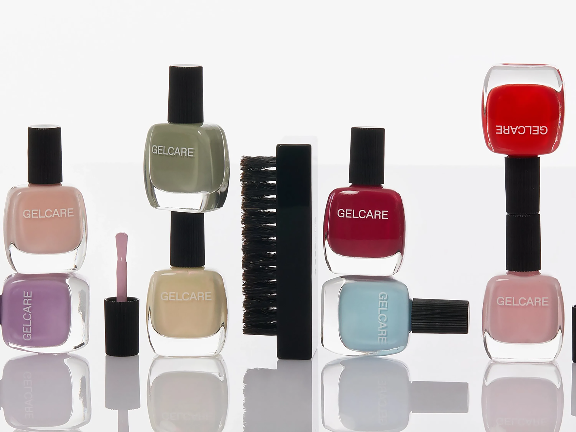
We knew from the beginning that we wanted a fan-shaped brush. It hugs the nail, reduces streaking, and gives more control—even for beginners. But finding the perfect balance between flexibility, width, and bristle density took time.
We tested multiple brush types across different formulas and application styles until we landed on the one that worked seamlessly with our texture: wide enough to cover in fewer strokes, but precise enough for a clean edge near the cuticle.
The Bottle
Our bottle design was just as considered as the formula.
We wanted it to feel timeless—something you’d be proud to keep on your vanity. We drew inspiration from the elegance of 1930s beauty counters: slim proportions, clean lines, clear glass. There’s something inherently special about the shape of vintage polish bottles, and we wanted to pay tribute to that era while still making it our own.
Our final bottle is made in Italy from clear recycled glass—a nod to sustainability, but also transparency. It feels weighty in the hand, compact but refined. Minimalism, with a vintage wink.
The Cap
Our ribbed cap is one of the most distinctive elements of the design. It was inspired by vintage aluminum caps of the early 20th century—functional, elegant, and tactile.
We recreated that feeling with a modern approach: lightweight, ergonomic, and made of polypropylene. The ribbing adds grip during application and gives the bottle its signature silhouette. It sits naturally in your hand and gives you full control, without slipping. A blend of heritage and innovation.
The Visual Language
Designing our nail polish line meant building a new visual identity that still felt like GELCARE.
Where our gel polish is clean and clinical, this line brings in warmth, nostalgia, and softness. But both had to live in the same world. We wanted the packaging to be unified by our colour theory, graphic language, and tone, and the finishes and forms needed to be distinct enough to stand apart.
The Process
From first sketches to final bottles, this project took over two years of development. Behind the scenes were spreadsheets full of formula data, CAD files, shade maps, packaging prototypes, and endless rounds of testing.
We worked closely with our manufacturing partners in Italy to perfect the bottle mold and brush dimensions. Our packaging team explored how this new format would live both online and in-store. And our product development team tested every formula under real-life conditions—not just in the lab.
We took our time. And we’re proud of the result.
What It Means for GELCARE
This launch isn’t a pivot. It’s a full-circle moment.
By offering both gel and regular polish, we’re giving our community more ways to express themselves—whether they want a long-wear look or the freedom to switch things up weekly. It’s not about choosing one over the other. It’s about having options that work for you.
Clean ingredients. Elegant design. Effortless performance. That's the GELCARE way.